

Carbon five Team:
1 Design Lead
1 Designer 👋
1 Design Intern
2 Developers
Client Team:
1 Product Owner
1 Junior Designer
Commonwealth Club of California
Site information architecture + UX + visual design for the Commonwealth Club of California homepage to coincide with the opening of their new club headquarters on the Embarcadero.
Project Brief
Carbon Five was tasked with updating and improving the Commonwealth Club’s main website to correspond with the opening of their new building on the Embarcadero. This included an update to their brand, visual design and updated navigation (information architecture) for their website. The site design was constrained by a tight budget as well as a need to stay within the Drupal ecosystem in order to allow access to archived recordings of speakers that date back to the 1920’s.
The Commonwealth Club of California, based in San Francisco, is one of the nation’s oldest and largest public affairs forum. Martin Luther King Jr., Ronald Reagan, Bill Clinton and Bill Gates have all given landmark speeches there. If you’re an NPR listener in the Bay Area, you’ve almost certainly heard rebroadcasts of their programming on KQED.
Project Duration
4 months
Landscape Survey
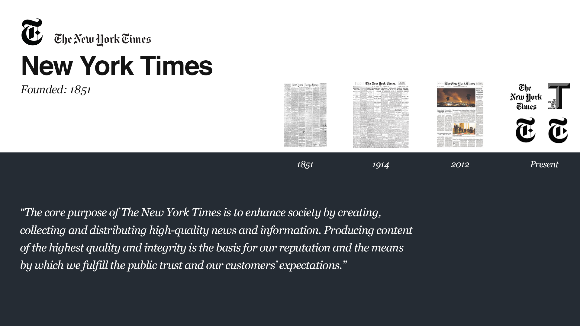
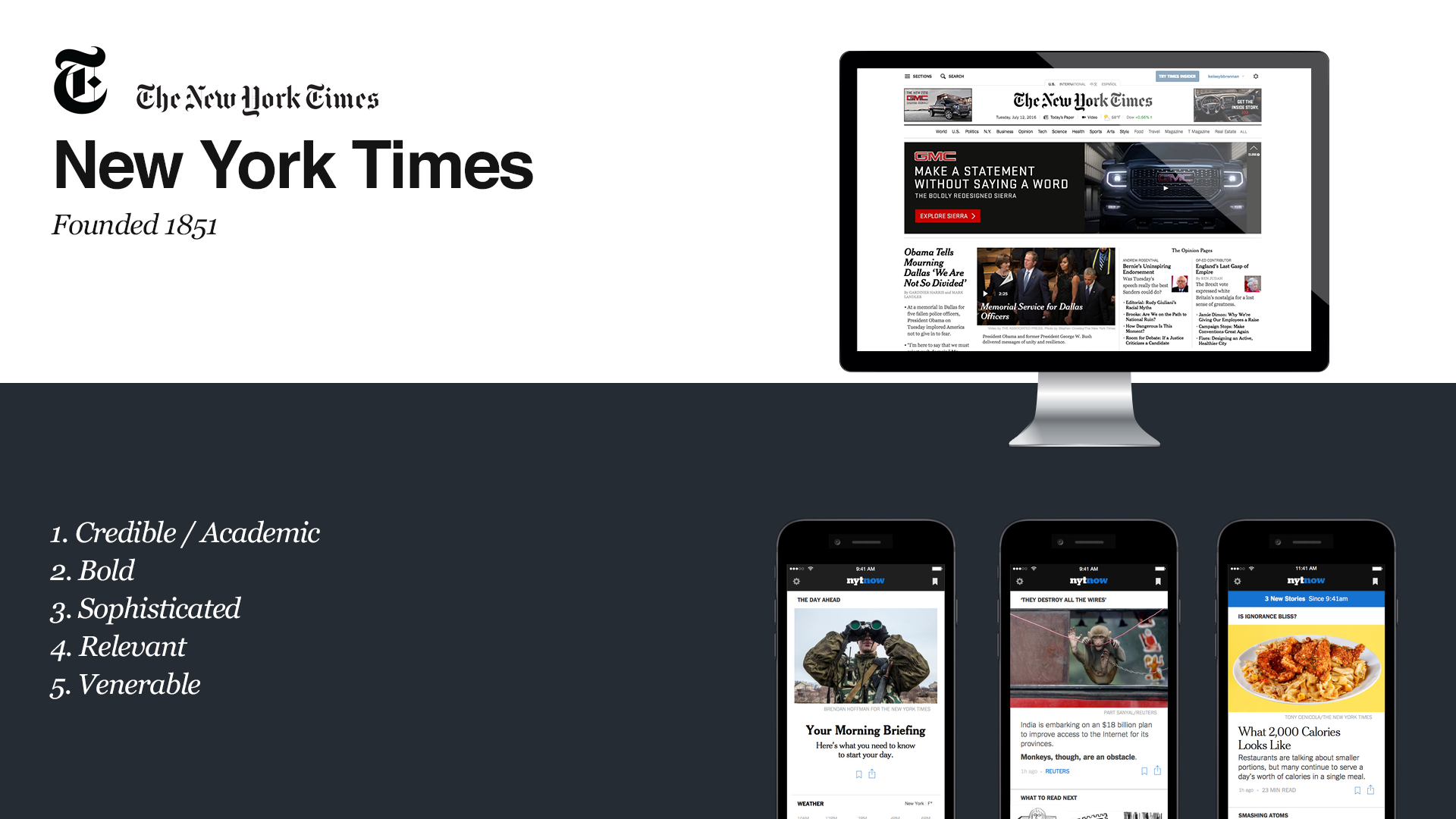
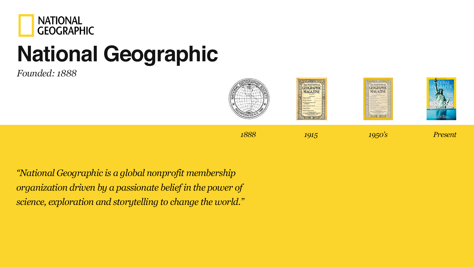
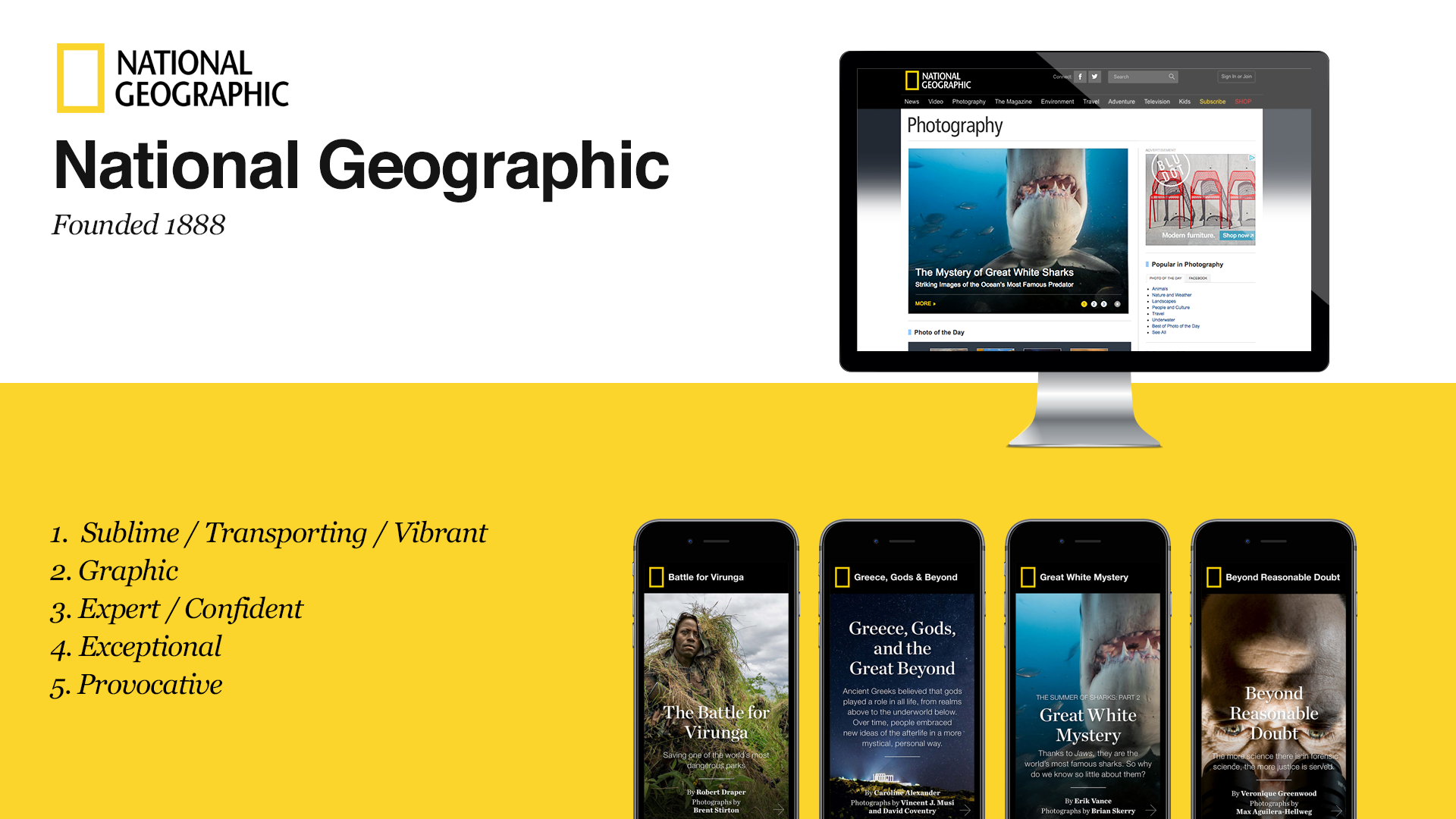
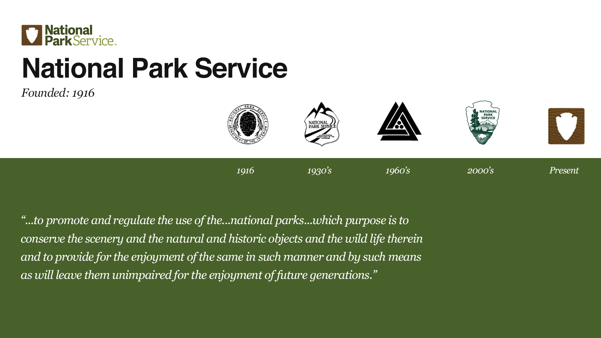
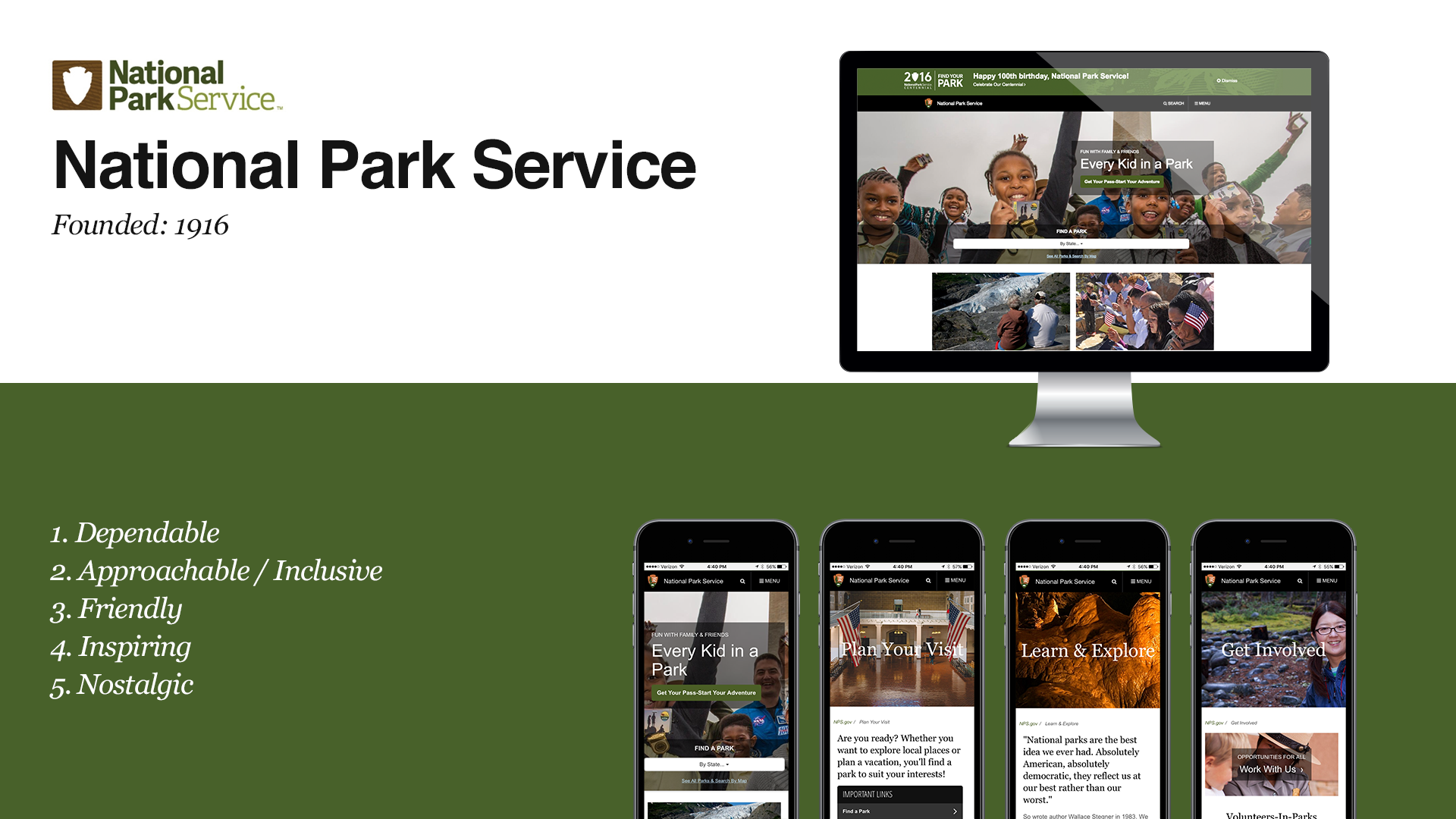
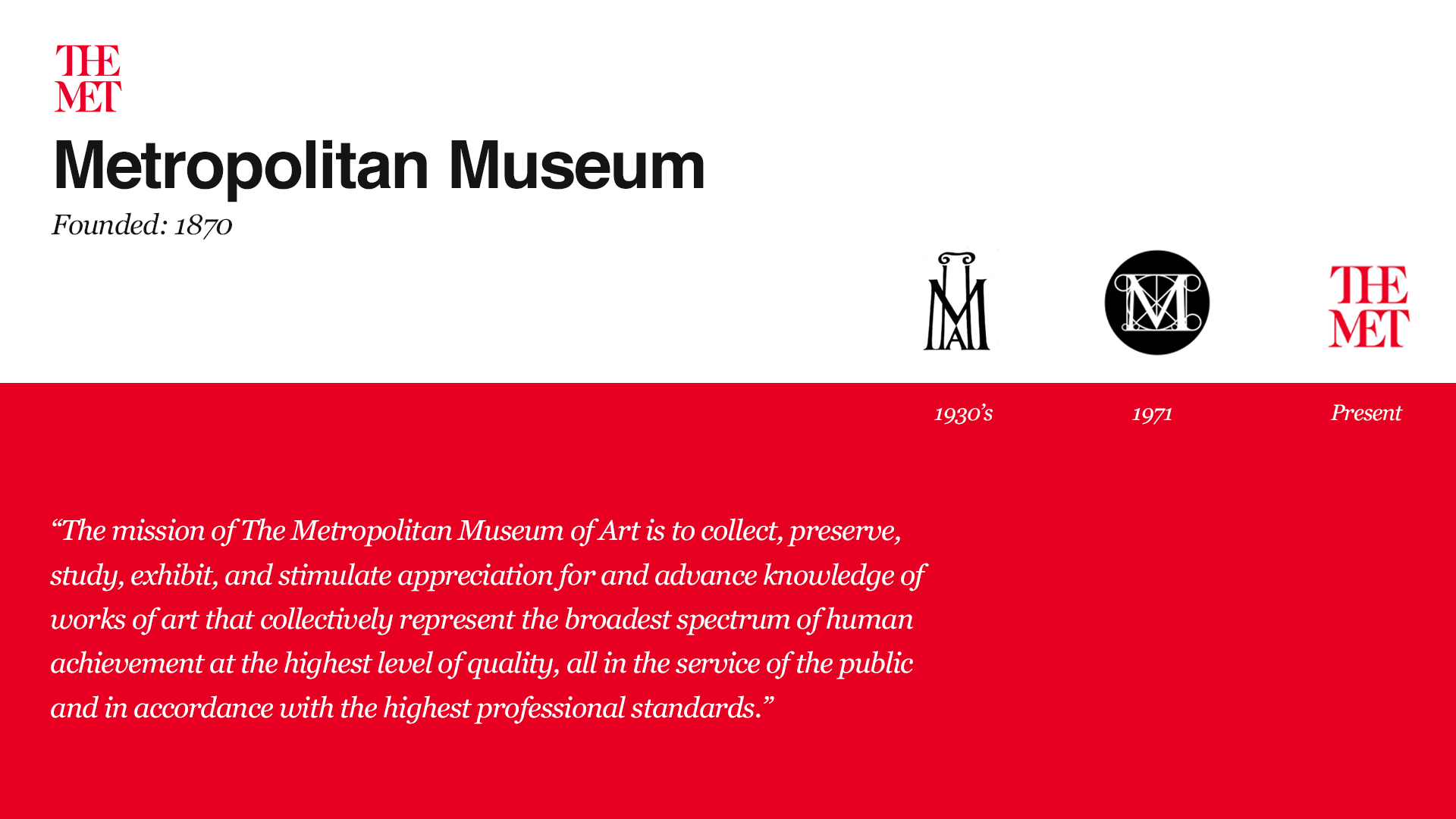
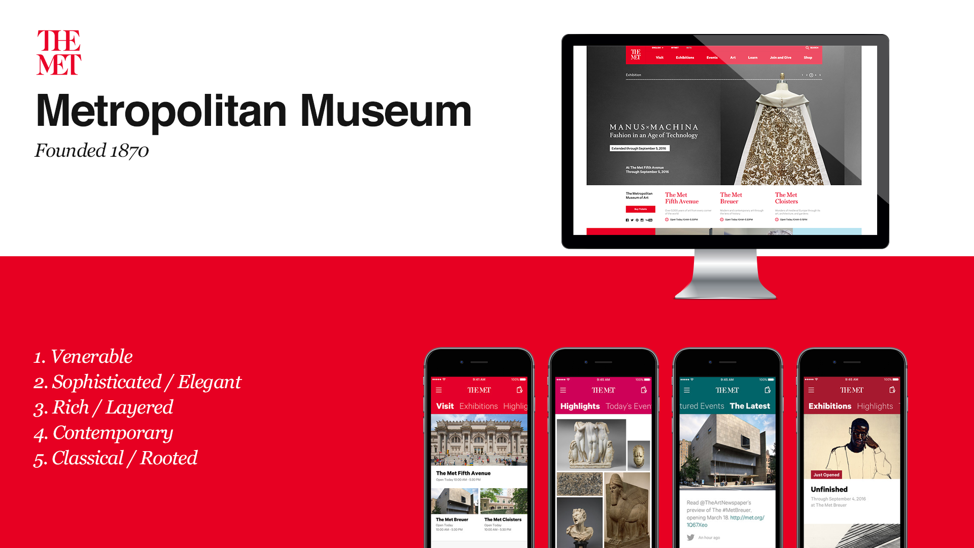
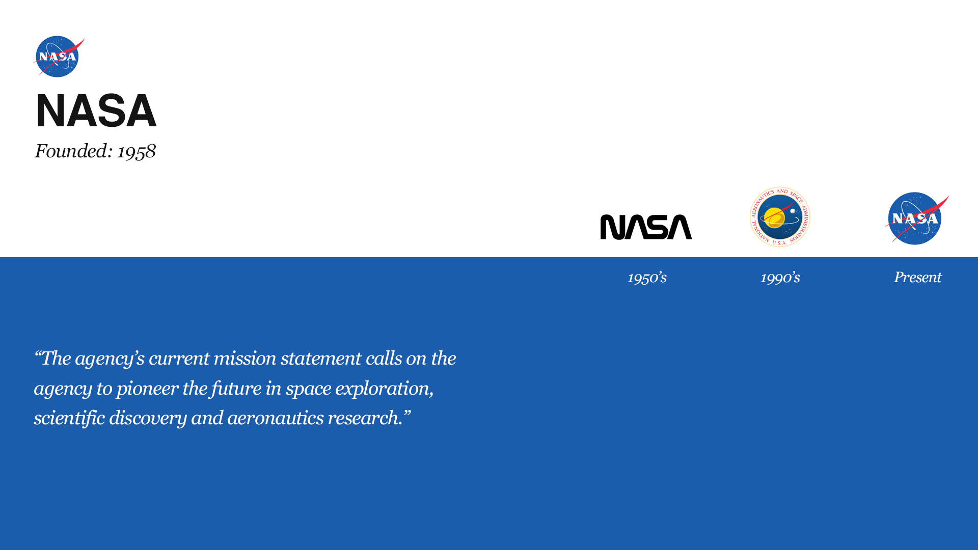
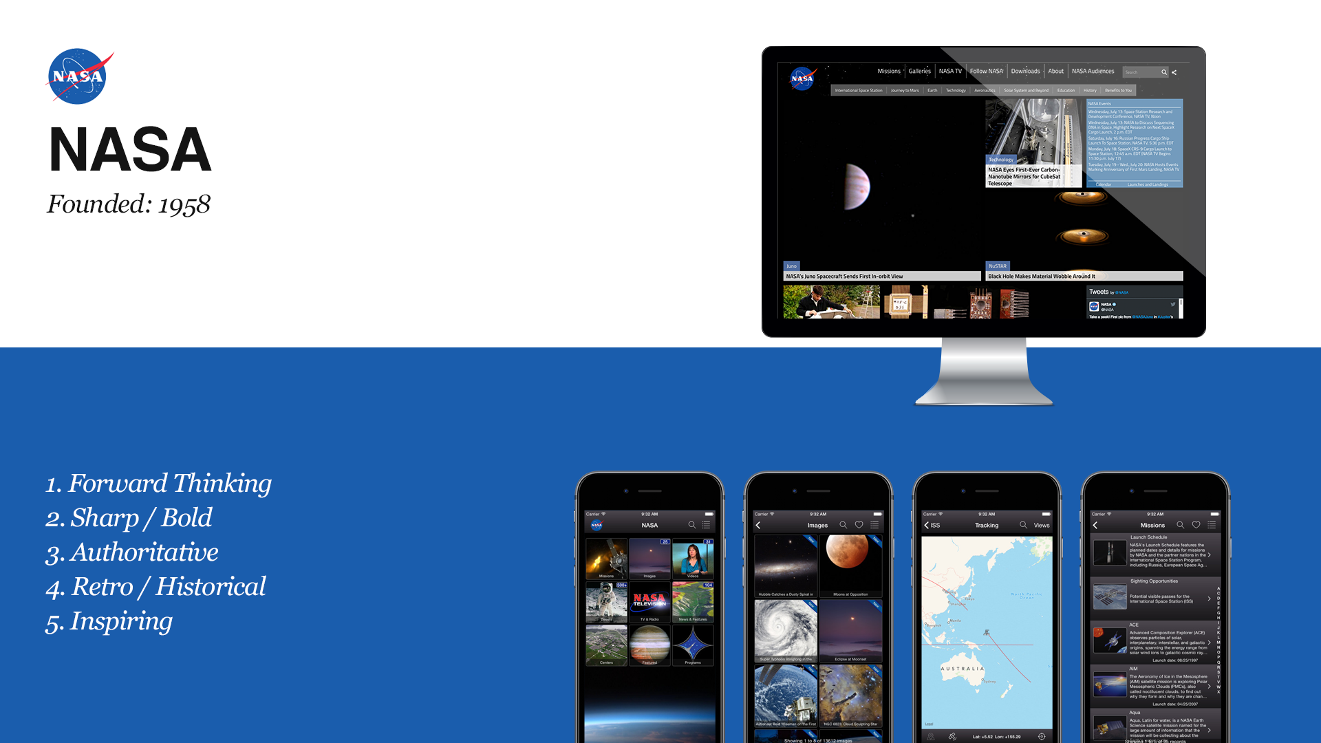
Given the age of and gravitas of the Commonwealth Club, we began our process with a landscape audit of other old institutions such as National Geographic, The Metropolitan Museum in New York City and and New York Times.
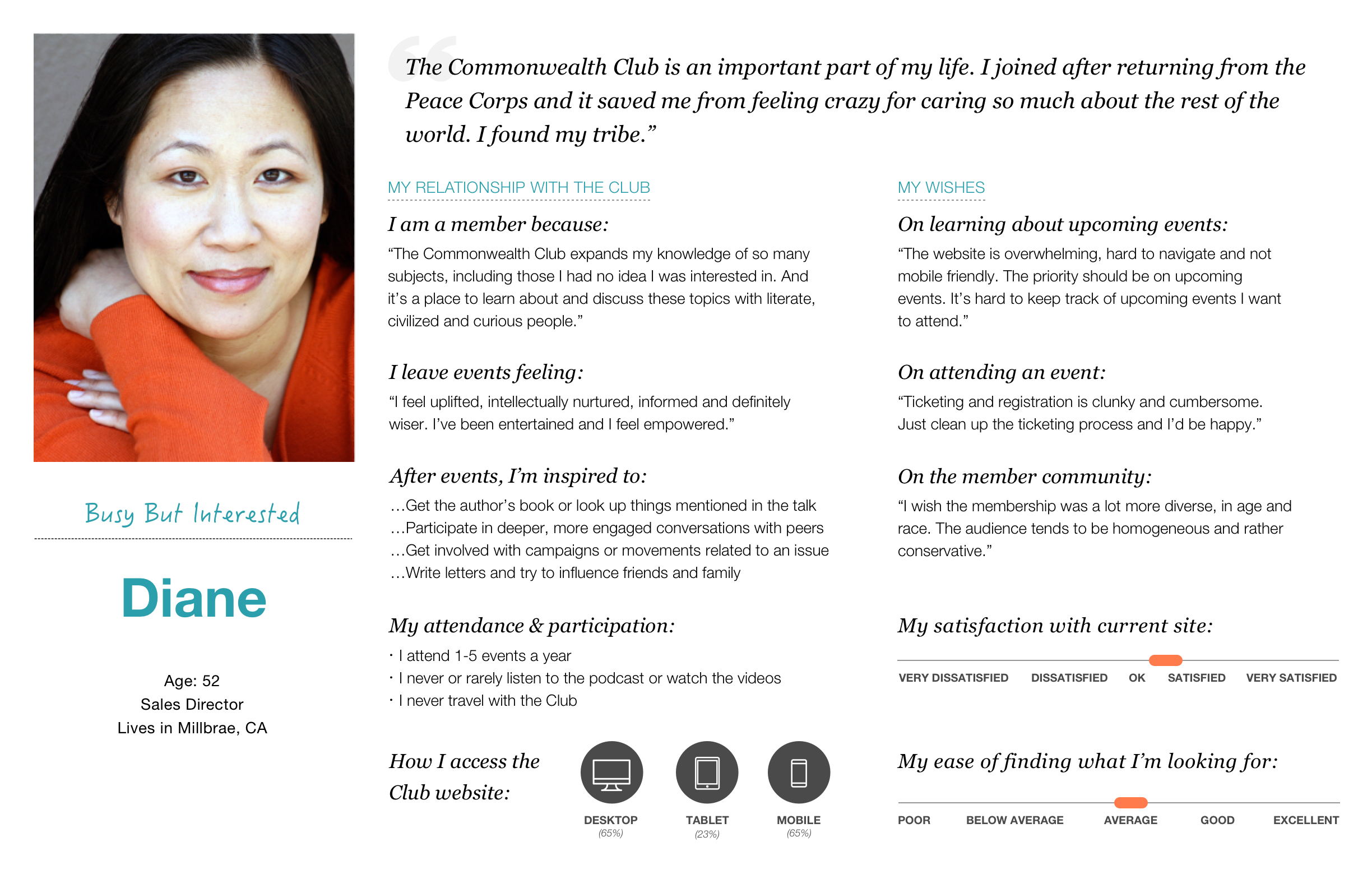
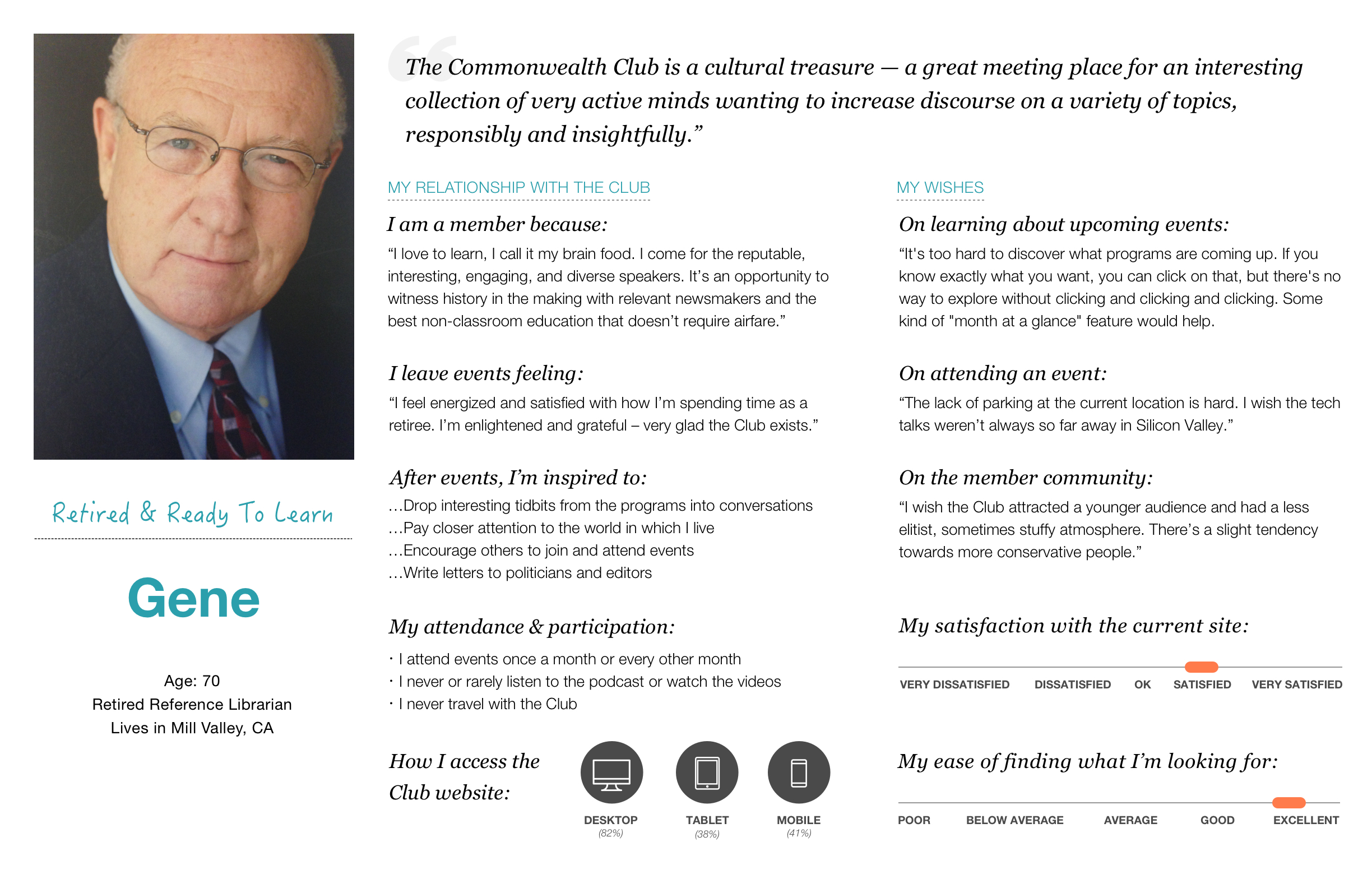
personas
One of the goals for the website and visual refresh was to bring a younger audience to the club. We interviewed club members, young and old, before diving into the look and feel of the club

Updating an image
To frame our conversations with stakeholders, we came up with six different concepts for style tiles which ranged from classical to very contemporary.
This was eventually distilled to our final proposal which took cues from the light and glass of the new building as well as a color palette evocative of the local landscapes, colors and artists of the Bay Area.


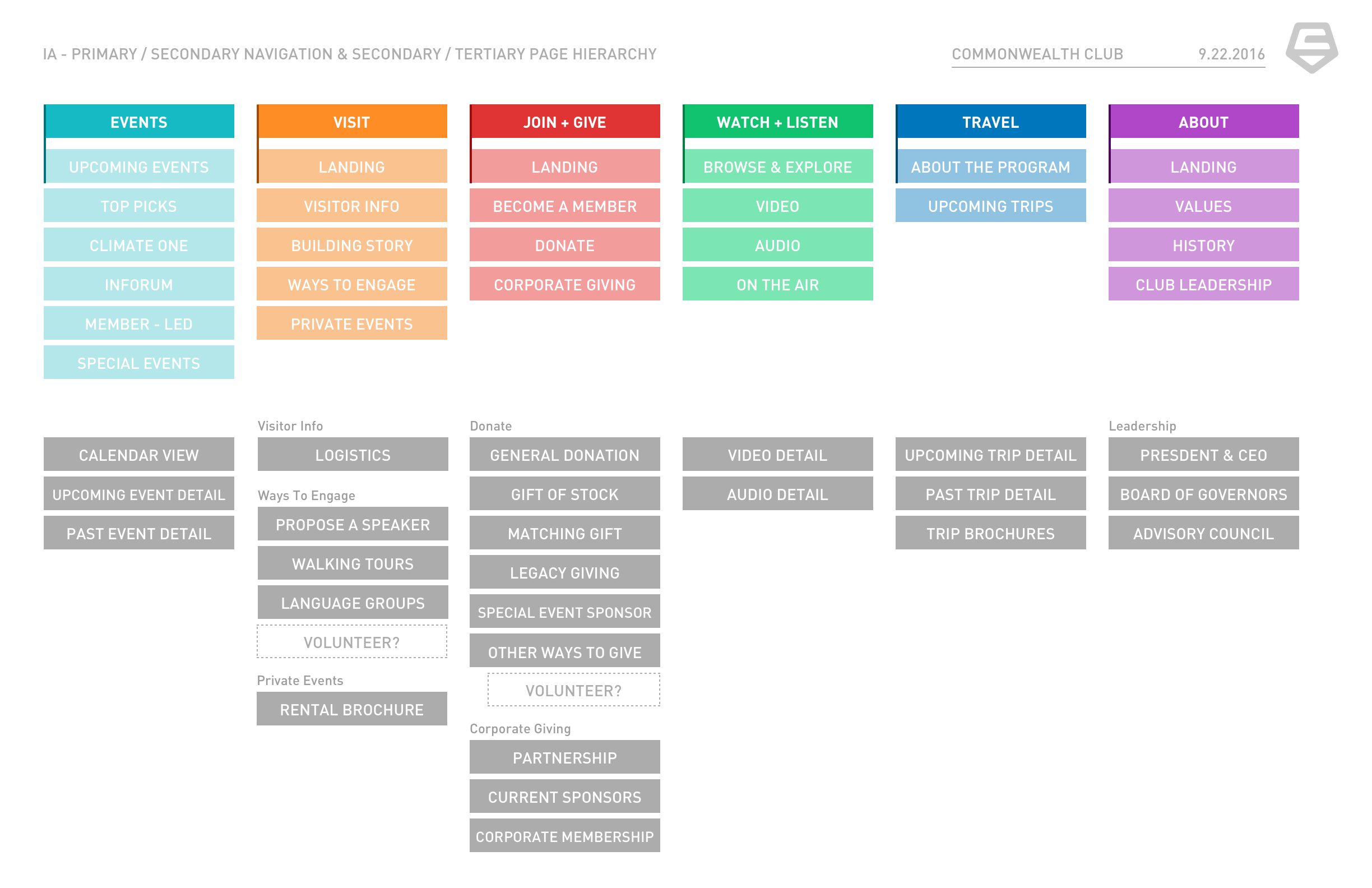
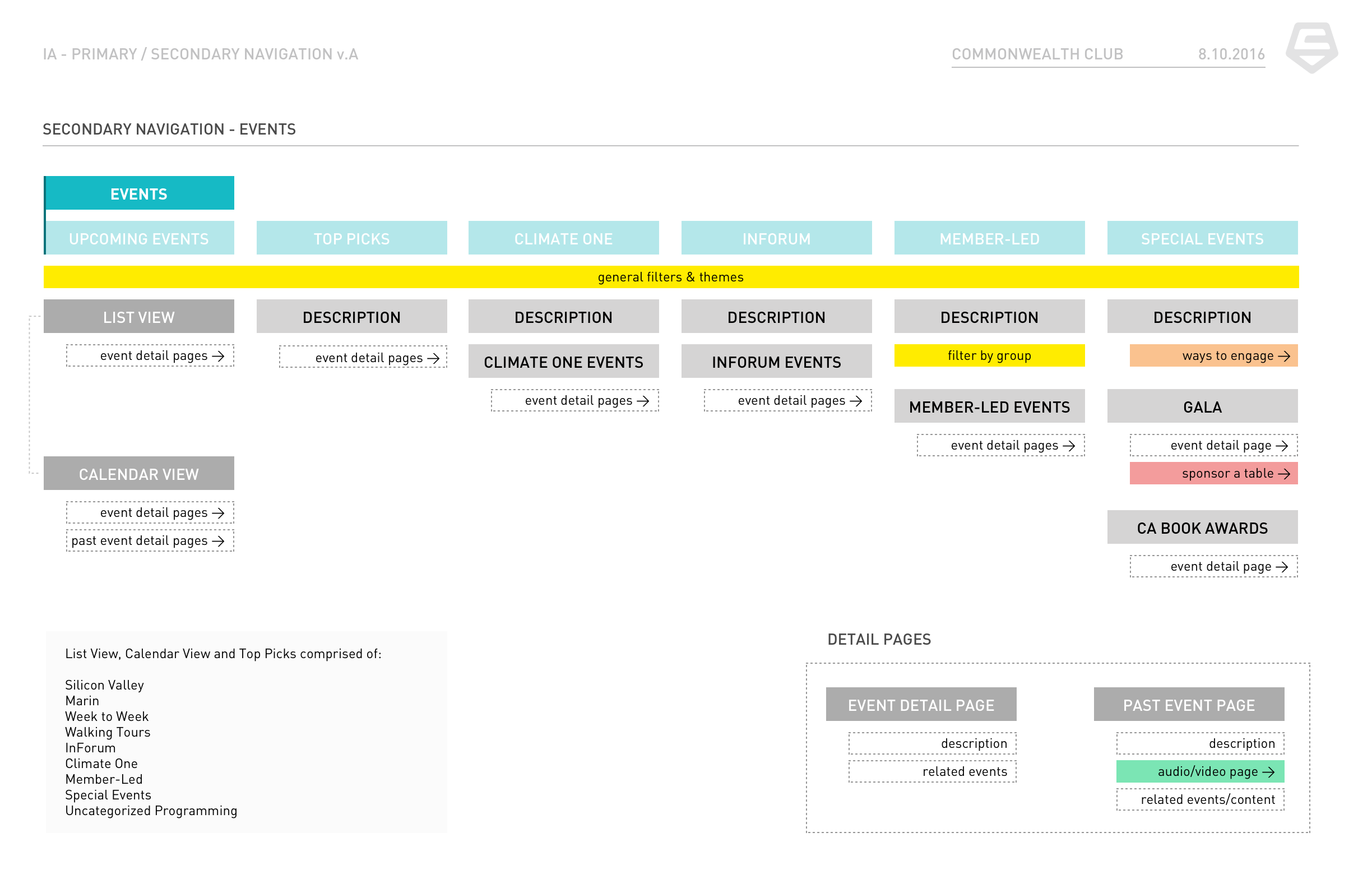
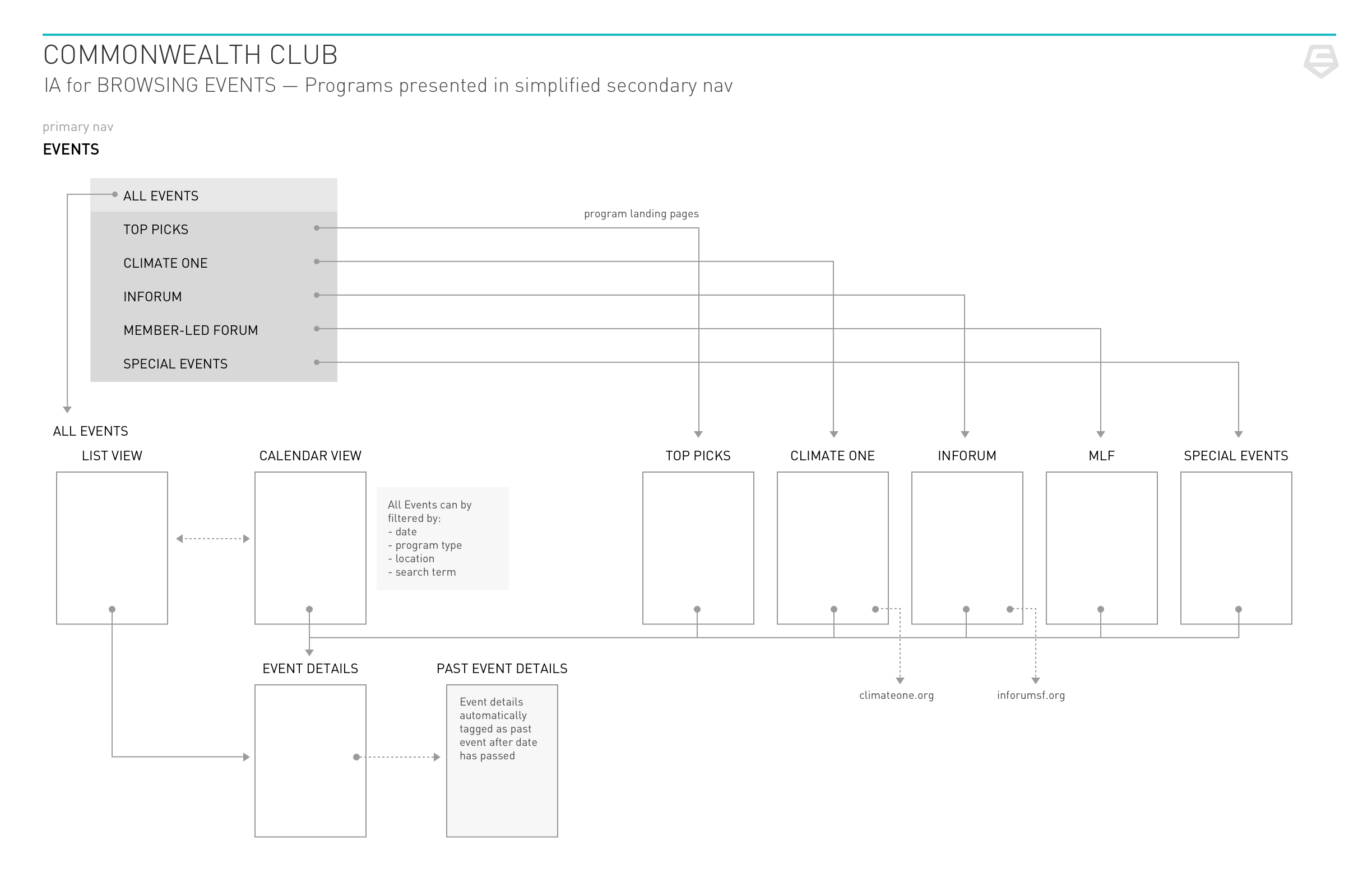
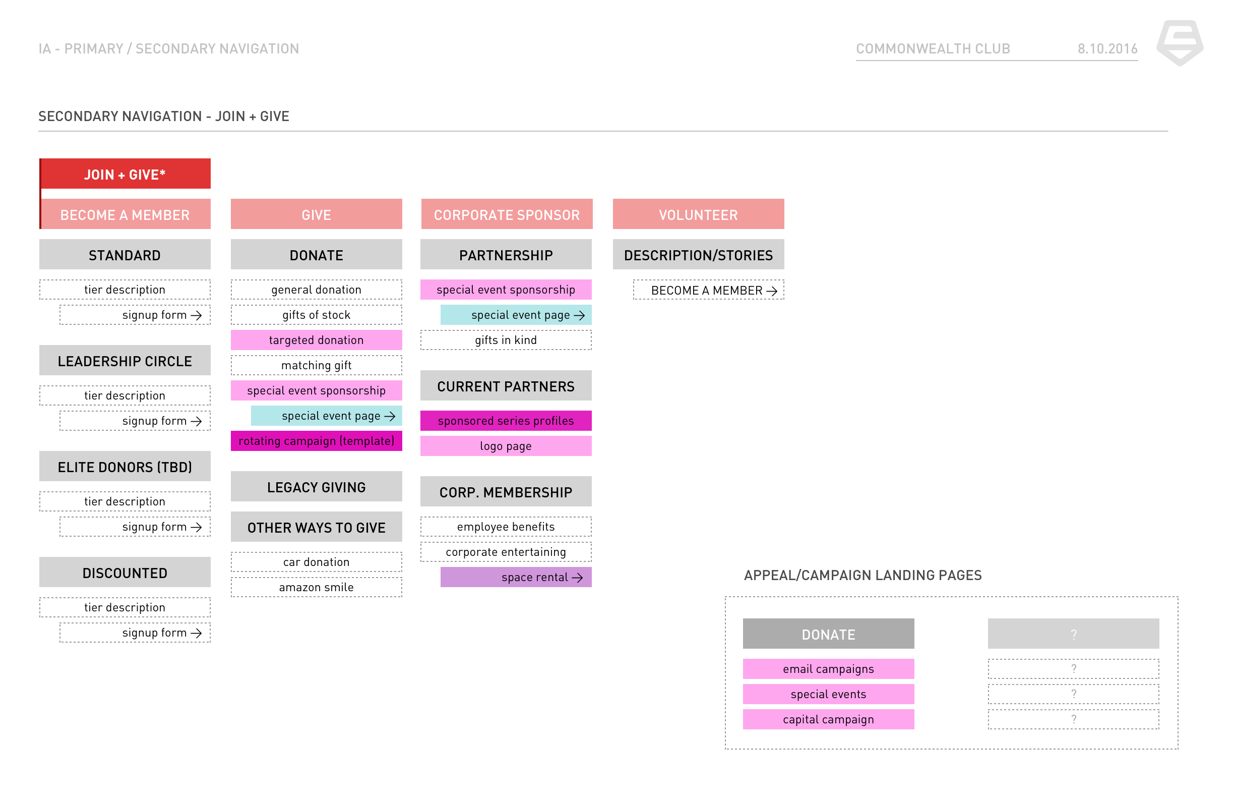
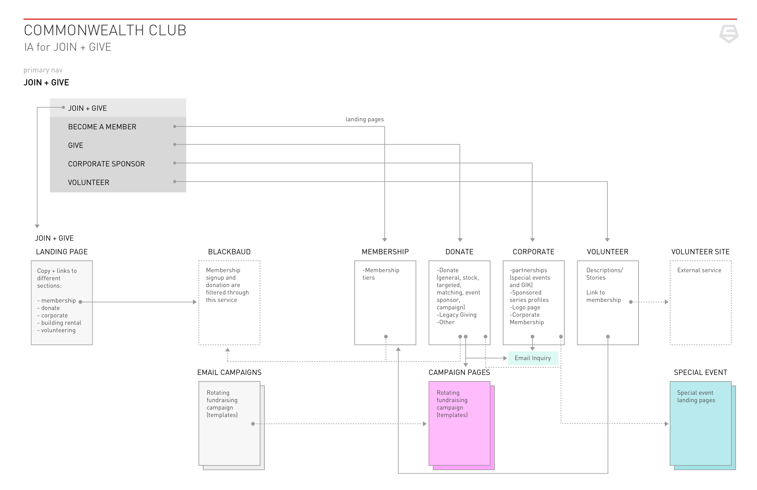
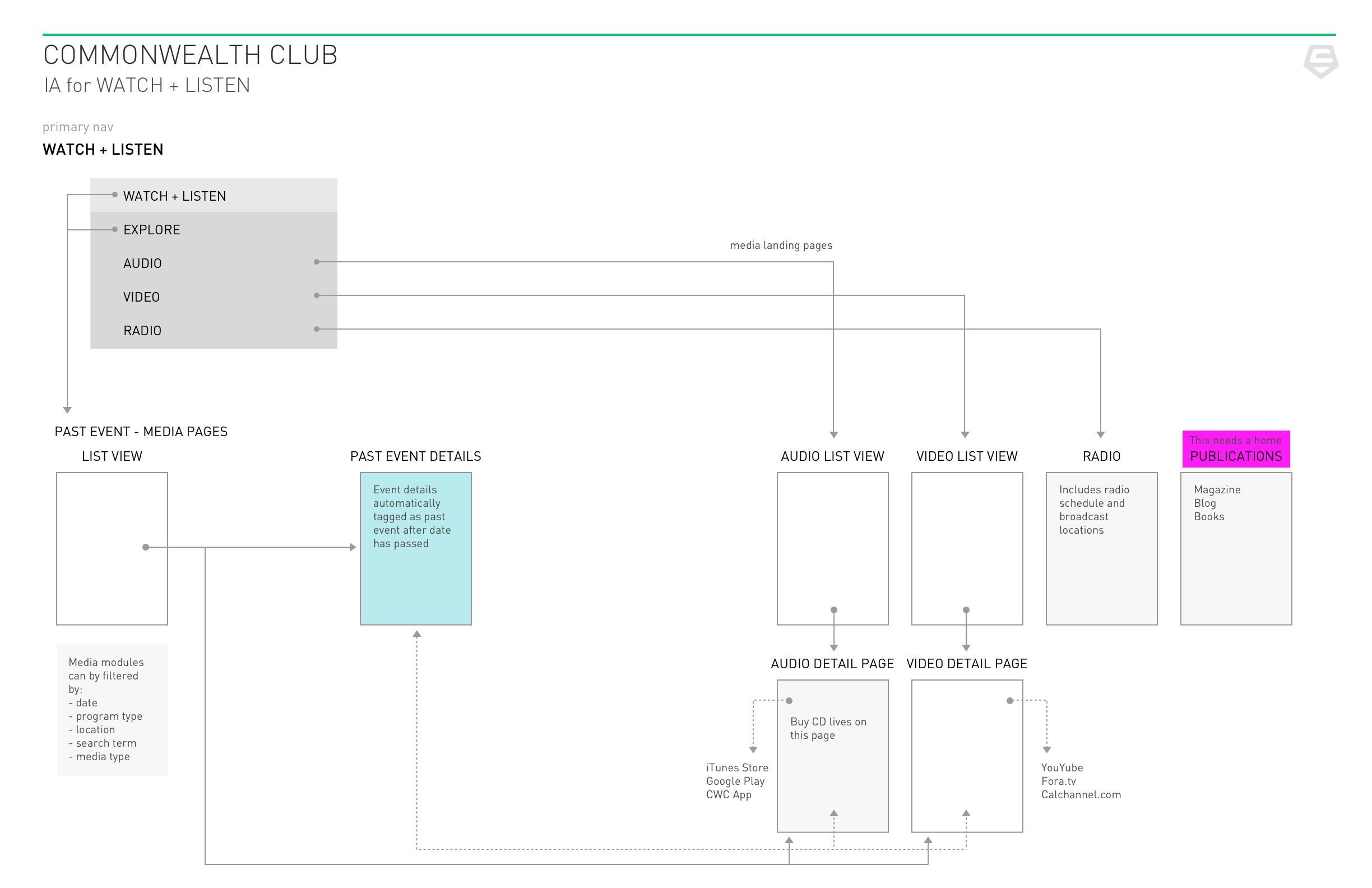
untangling a very, very old site
At the same time as we were doing the visual exploration, we were also auditing the current site structure which evolved from a Drupal template that was implemented in ~2002 😧.We were further constrained by needing to allow users to access legacy content that dated back as far as the 1920’s.
To the right are card sorts and site maps generated from our audit as well as interviews with stakeholders about their individual needs for each section of the site (membership, events, travel etc.).

card sort

99% the same is still custom
Because of the constrained budget and Drupal, we had to approach the project as a system of modules. We made a site of building blocks because a content site is just a website that makes a website.
After doing individual page design, we looked at our work across pages with an eye for consistency— up-leveling components into module “types” in order to give our client a kit of parts to assemble their own pages.

Bringing it all together
Here are some sample screens where we left off the project.
My work included all pages shown here - with the exception of this screenshot below of what we started with.

The original homepage

Upcoming events page

Upcoming trips page for club travel

Home page
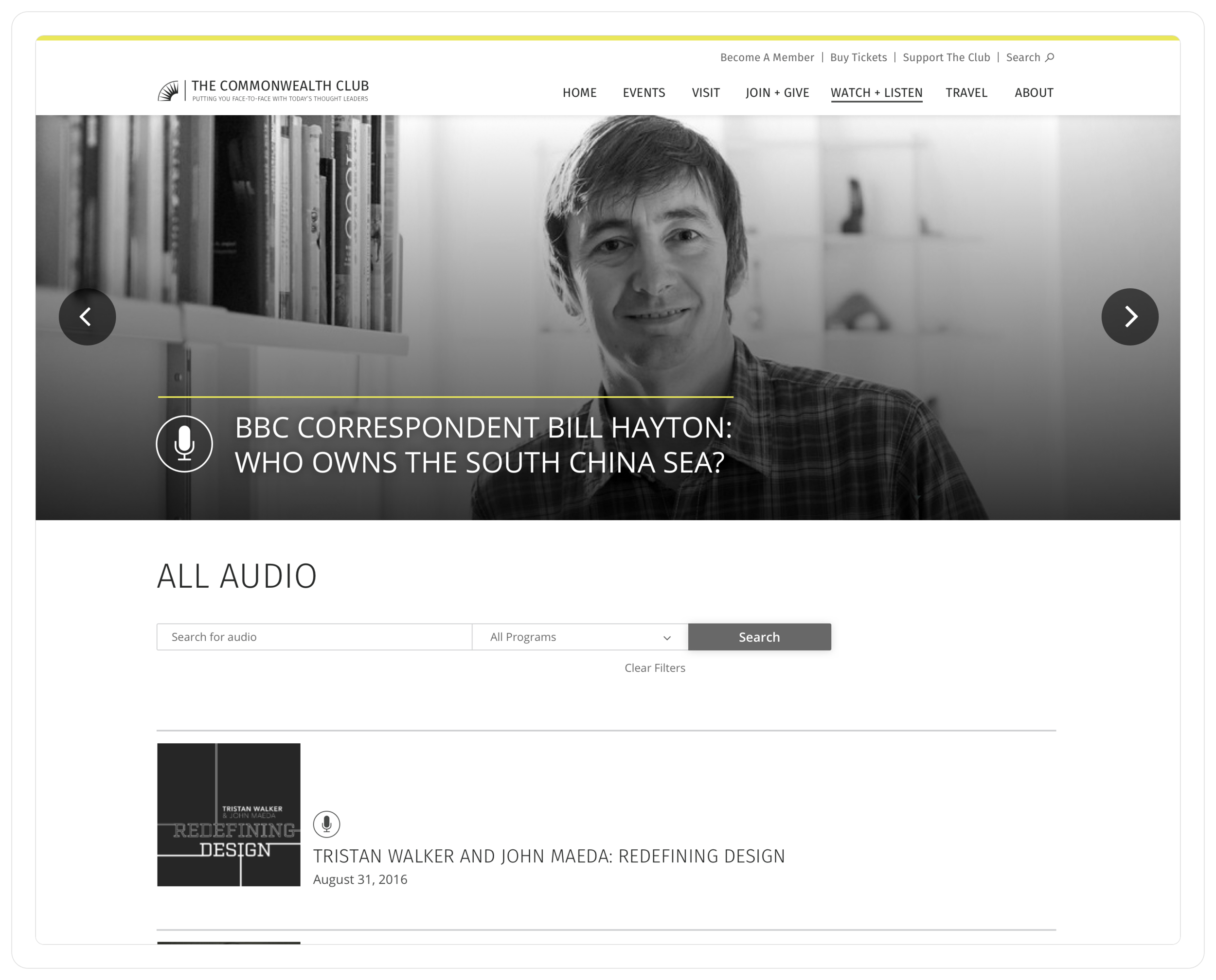
All audio recordings page
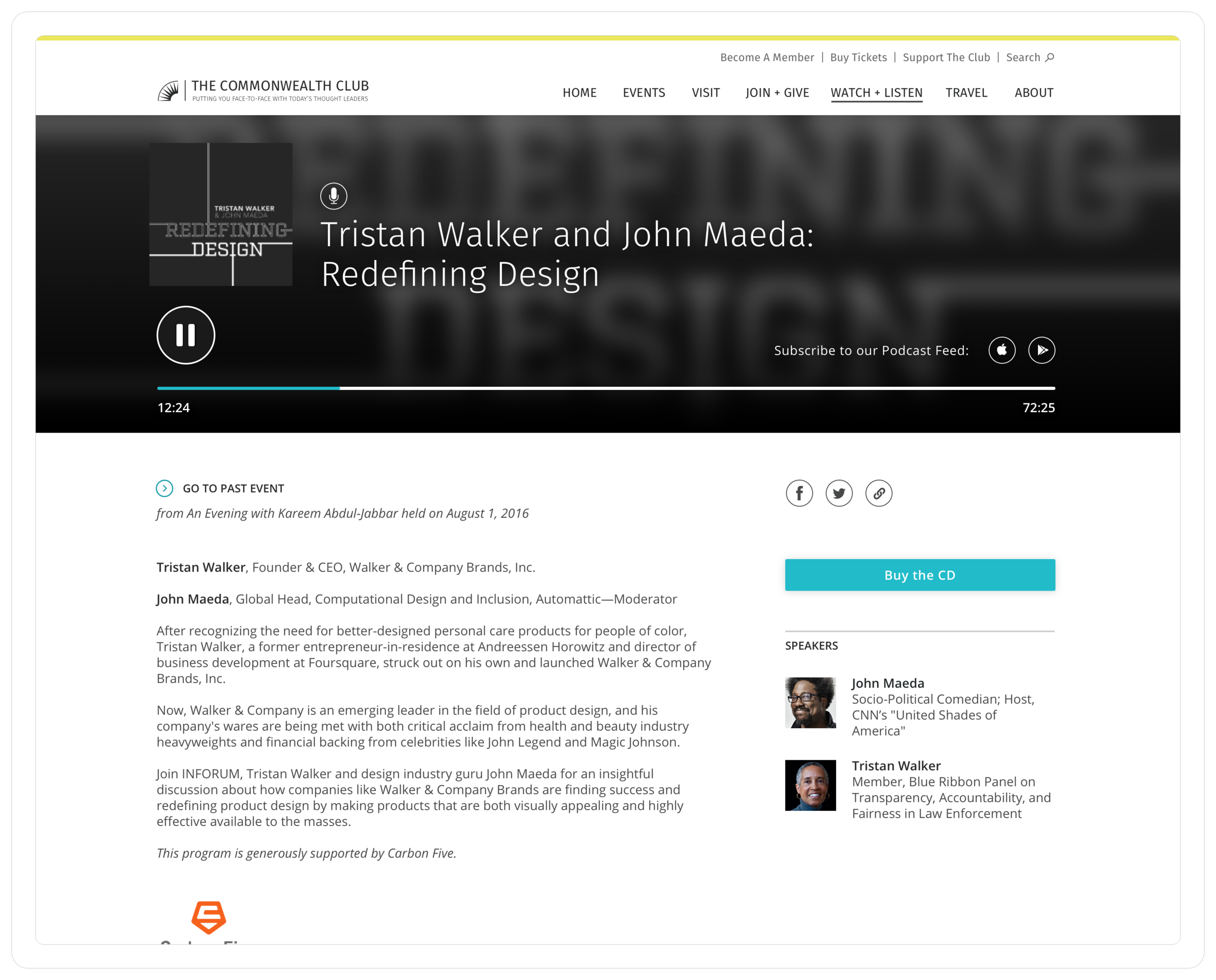
Audio detail page