Carbon five Team:
1 Design Lead 👋
1 Product Manager
4 Developers
Client Team:
1 Product Manager
1 Tech Lead
1 Developer
1 Junior Designer
Brandless™ E-Commerce site
UX + visual + interaction design for the initial launch of the Brandless™ e-commerce site as it premiered on the Today Show in July 2017.
Project Brief
The client came to Carbon Five with brand identity and package design from the branding firm Red Antler. We were tasked with the design and development of the core e-commerce site, checkout flows and B.More subscription service. We implemented the project on-time under an extremely accelerated deadline dictated by a scheduled product launch on the Today Show.
Brandless™ had a successful launch and recently received $240M in Series C funding. Images are from the original launch, check out how they're evolving here.
Project Duration
3 months
Brand translation
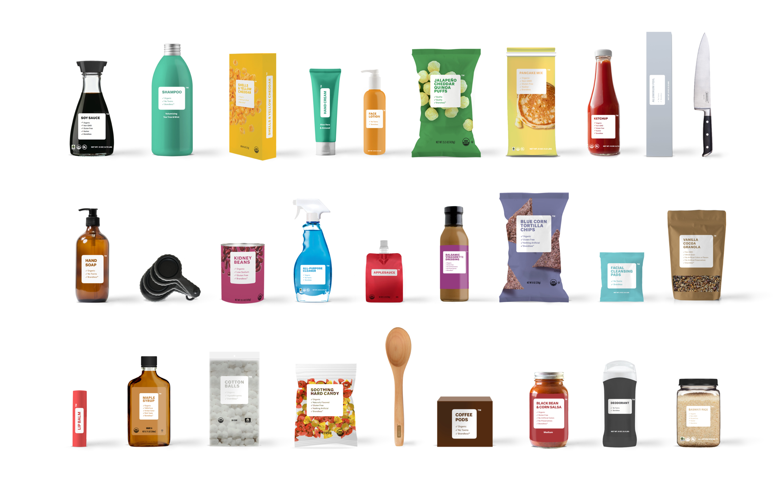
Brandless™ already came to Carbon Five with brand identity and product package design done by the firm Red Antler. Our task was to extend the brand assets to web styles in developing their online store. This included many iterations that had to get approval from Brandless™ stakeholders as well as Red Antler.
Layout and Grid
Designing mobile first was critical for this project, given the accelerated timeline (a launch on TV). The grid was based on 4 columns, which allowed mobile components to be re-used on desktop and vice versa.
from left to right: home, "shop all" page, category landing page, product detail page
INTERACTION DEtails
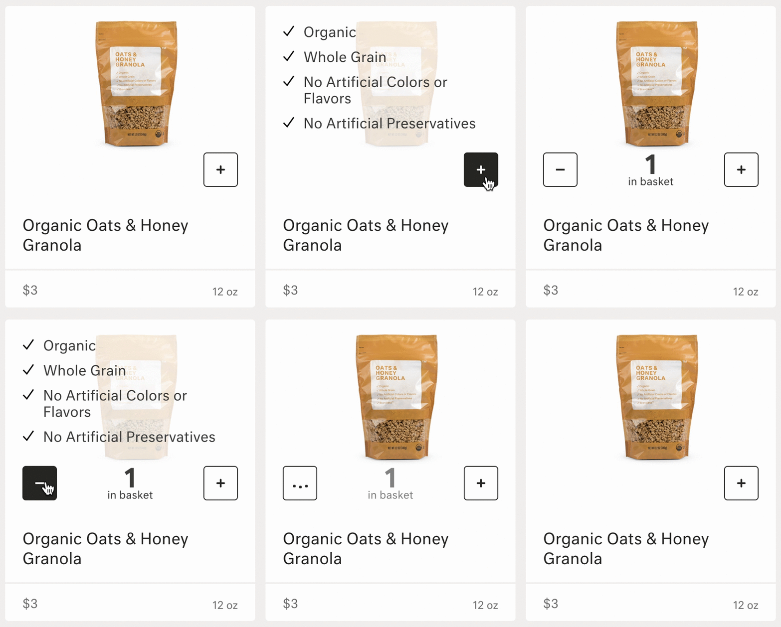
By the end of the project we were able to add custom animations to features. To the right is the "add to cart" animation that allows users to add and see how many items were in their basket without viewing their their list in checkout or the product detail page.
Systems and Styles
We left Brandless™ with a fairly extensive style guide that their developers could follow until they made their first design hire.
from left to right: components, icons, modules
Bringing it all together
Here are some sample screens that we ended the project on for the company's launch on the Today Show.
My work included the homepage, accounts, cart + checkout, category landing pages (CLP), product detail pages (PDP), B.More membership signup, and referral program.
from left to right: home page, "shop all" page, category landing page, cart, account page
The "shop all" page acts as a summary view of the different categories of products offered. It also introduces the idea of “kits” that allow the user to add various items at once to their basket.
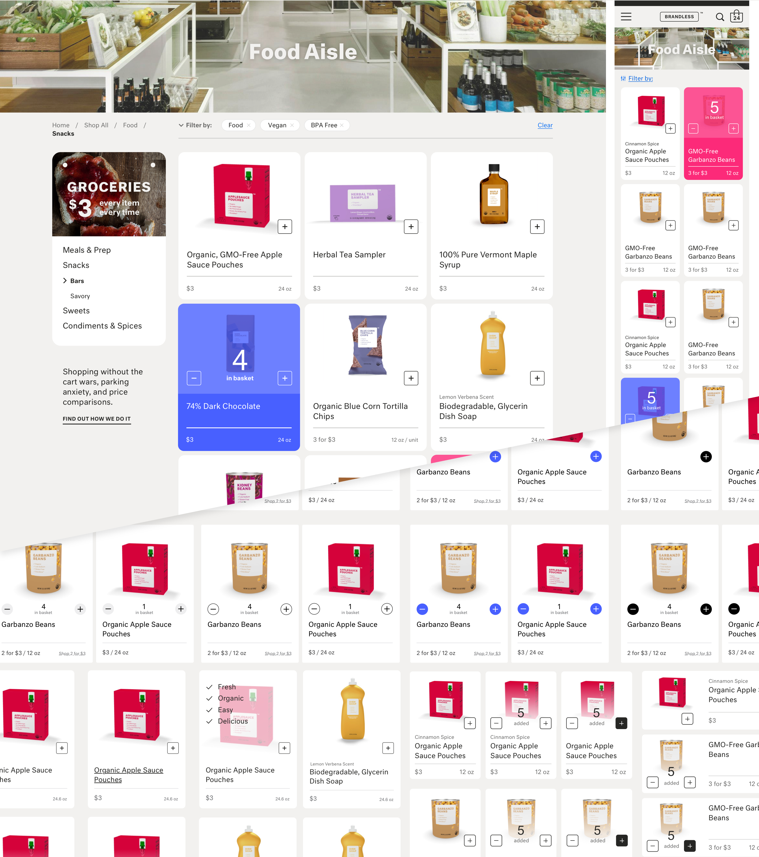
The category landing page groups products by category to allow users to better brows and filter their results. We referred to them as “aisles” to give a more personable tone.
The product detail page allows users to view more details for individual products. It also reuses mobile components in the lefthand column to allow users to shop related products.
The home page re-uses components from the the category landing page and also allows customers to explore more about the brand and membership.
The account page allows users to checkin on existing and past orders as well as manage their profile & membership.


